Wednesday, March 8, 2023

CAMBRIDGE PORTAFOLIO PROJECT: story progress

Welcome Back!

So a little back story, I missed the past two weeks due to some complications with my wisdom teeth removal (I know it’s irrelevant), but because of this, I have not been able to meet with my wonderful teacher Mrs. Stoklosa. We have weekly meetings with her to discuss our blogs and our progress, but since I was out I was missing that feedback to continue my story. 

As I have discussed many times before, my intro starts with a very upbeat and intense sequence of shots but there has to be a story follow-up to those videos. I want to make sure I don’t give off the wrong idea of my intro being a documentary so I also want to focus that the editing reflects a vintage camera. The great question is “what are these videos? Where do they come from?”. There has to be a follow-up with the contrast I discussed and I want it to be a good one. I don’t want to be boring or predictable. After discussing many possibilities, I concluded that a “missing” storyline would be a good option. 

Let’s imagine the intense sequence of shots is over, we see a high-angle shot of the back of a girl kneeling over a messy box holding the camera. The quality difference is obvious, the color change is dramatic and the watcher wonders why the sudden change. A low angle follows a point of view from inside the box as this girl (the watcher realizes it is the same girl as the videos) moves objects around (blocking some of the shot). She opens a newspaper stating “MISSING” as it cuts to an intense close-up of her crying eyes. 

I fell in love with the idea as we discussed it, but we also had some good ideas for additions. 

- a Facebook page (to represent the time and setting)

- printed newspaper prop

Stay tuned to see how it turns out! 

Sunday, March 5, 2023

CAMBRIDGE PORTAFOLIO PROJECT: special effects

 Welcome back!

    For today's blog post, I wanted to discuss how “special effects” are going to work for my film intro. The thing is I'm not going to really have “special effects”, is more like filters. I don’t intend to have to add anything that drastic to my film when editing but I want to be prepared just in case.

    As I mentioned before, I plan to record most of the into with an old camera that I own from old family vacations. The thing is… it won't turn on :). I’m still trying to figure out how to make it work but just in case I want to have the option of filming with a regular camera and then editing it into looking retro. Of course, that would take the essence out of it but that's the best I can do. 

    So, as I did some research on how to add this look to my videos I found some YouTube videos that gave me some great ideas on how to achieve the film look I’m going for. 

https://youtu.be/6m1Xli7Twqs

https://youtu.be/oT60rchznSc

https://youtu.be/D34p3oTRnY4

https://youtu.be/45z60vnPOBw


All of these videos were a great help and they definitely make me feel more calm about using a regular digital camera. I’m sure they’ll be extremely helpful during the editing process. 

Stay tuned to see how it turns out!


Saturday, March 4, 2023

CAMBRIDGE PORTAFOLIO PROJECT: location scouting

Welcome back!

    While planning the shooting schedule, I thought it would be a good idea to brainstorm some possible filming locations. While doing some research on location scouting I found this website called “Giggster”, this website helps you find places you can rent in your area for production. Prices vary and there are many different options to pick from. This is way out of my budget, but I thought it would be a fun thing to mention since it could be a great option for future projects.


Here are some locations I have in mind:


CAR SCENES:

Vista view park I believe would be a great option for our car scenes specially for the background. Since Weston is very dull, I think this location could add some great color with the hills on the background.


BEACH SCENES

Dania beach I think will be the best option, its clean and not very popular so that way it won’t be crowded during filming. Here are some pictures I took at Dania beach during sunset as an example;


RIDING BIKES

For the riding bikes scenes I have the perfect location in mind that I believe work best and are also the most aesthetically pleasing. Regional park has a bike riding section in the back of the park, i know this area very well and there is a specific trail that I think can give me the look I’m looking for. 


These locations may vary and might even be changed last minute. I think these are all great options for our future filming locations :)

Stay tuned to see how it turns out!

Friday, March 3, 2023

CAMBRIDGE PORTAFOLIO PROJECT: mood boards, aesthetics and wardrobe

 Welcome back!

For today's post, I’m going to focus on how can I achieve the “look” I want for my film intro. As mentioned before I don’t just want the beginning of the intro to have a vintage look, but I want to actually film with an old video camera to make it as realistic as possible.  Down below I’m going to insert a picture on what’s the look going to be. 


I personally believe mood boards are crucial when it comes to wanting to achieve a certain “vibe” in a film. Especially if the film has a big artistic intake, I find mood boards as a great source of inspiration when it comes to filming. 
Here are some mood boards I’m going to share with my team when filming:


As of aesthetics and wardrobe I want to keep it as casual as possible, I want to include college sweatshirts to show and represent the age their in, baggy jeans, and t-shirts.
 
Stay tuned to see how it turns out!


Thursday, March 2, 2023

CAMBRIDGE PORTAFOLIO PROJECT: shooting schedule

 Welcome back!

I believe it’s time to get started with my film production :) I think I’ve done enough research to make this the best production I can with my resources. I created a shooting schedule with dates on how I’m going to organize everything:


Stay tuned to see how it turns out!


Tuesday, February 28, 2023

CAMBRIDGE PORTAFOLIO PROJECT: color and design

Welcome back!


    For today’s post, I wanted to focus on color and design in film, I watched some of the most recognized movies by color and design; Written on the Wind, Vertigo, Moonlight, Amelie, and The Grand Budapest Hotel. All of these movies have outstanding color and design schemes that show color is very important to a movie and give the movie a set and determined tone. 

    Color facilitates storytelling, color up-brings the watcher’s emotion, that be blue for sadness or red for anger, color is more sophisticated than that. Color includes “HSB” which stands for “Hue”(color), “Saturation” (intensity), and “Brightness” (light and darkness) which can help create a whole new visual transformation. Color in film can be used to bring attention to specific details, set tone, represent character traits, and show changes in the story. 

    Choosing the right colors for the right things will create emotions the audience will probably not even be aware of. Picking color for your film is more than just randomly choosing, it's a thought process and some might even call it a “philosophy”.

    In my film intro, since I want to give that retro/ vintage feel, I want to focus on very vibrant colors. Bright colored sunsets, yellow and reds so there is a great contrast with the blues and greens of the following sequence. I’m going to attach an example down below: 


(https://www.studiobinder.com/blog/how-to-use-color-in-film-50-examples-of-movie-color-palettes/)


    I want the change of the color scheme to show the characters' development or change compared to the past. Unlike “Breaking Bad”, where their character development is over time, this is going to be a dramatic change from one scene to another.


Stay tuned to see how it turns out!


Sources:

    Risk, M., Mary Risk A freelance writer and producer, & producer, A. freelance writer and. (2021, June 8). 50+ examples of movie color palettes. StudioBinder. Retrieved February 28, 2023, from https://www.studiobinder.com/blog/how-to-use-color-in-film-50-examples-of-movie-color-palettes/ 


    5 ways to create a film color palette: How to use color in the film - 2023. MasterClass. (n.d.). Retrieved February 28, 2023, from https://www.masterclass.com/articles/how-to-create-a-film-color-palette 


Sunday, February 26, 2023

CAMBRIDGE PORTAFOLIO PROJECT: character background/ storyboard ideas

Welcome Back!

    So as far as my story goes, i want to merge both my ideas and focus on one story instead of multiple random shots. My story is going to follow the one main character. I still want to peruse the ides of an old film camera filming the main character’s past, but I think i am going to add more protagonist energy towards other characters as well. The main character will be filmed mostly with her best friends and as the scenes go on, when she is shown all alone I really want that contrast of being alone to being surrounded by people and love to be evident. 

Here is my story board of ideas, (not my final draft)

    This is just some brainstorming ideas as to what my possible storyboard could look like, in the end it probably wont be exact but these are my ideas for now. 

Stay tuned to see how it turns out!

Thursday, February 23, 2023

CAMBRIDGE PORTAFOLIO PROJECT: getting my story together

 Welcome Back!

    So I dedicated myself today to get my story together, as I explained before I had some different ideas to the outcomes of the end of the into. At the beginning, I was thinking about a very laid back concept of a camera on senior kids being passed around. But the more I thought about it the more I came to the conclusion that this was a project that I couple really excel on so I wanted to step out of my confort zone. I wanted to try something new so I went with the opposite of my main idea, I went for a plot twist. I really want to leave the watcher wanting more. 

    As explained in previously, I had two main plot ideas (if you’re interested in reading them in detail go here) so I decided to combine them. One of my ideas included filming in a court room, i really wanted to peruse this plot line since I thought filming there would be a really fun and original location to include. I knew filming there would be extremely difficult to achieve, and it was. One of my friends actually have a law internship with the city in Weston and she works at the Broward courtrooms quite often. I texted her wondering if there was any way I could talk to anyone about this or if there was any type of procedure. This was totally a shot in the dark, she told me it might be a possibility if I used the “it’s for a school project” excuse. I actually got around to talking to her boss and I was told that due to privacy purposes I couldn’t film inside the courtroom but I could film outside. She was very nice and was a great help but at the end I decided to turn a different way. Not being able to film inside wouldn’t be the same and that was the essence I wanted to capture. Eventually, I came to the conclusion that maybe I shouldn’t complicate myself too much, I could just go for the simpler story. It was a story with great potential so I put my 100% to making it the best I could, but I’m leaving that for my blog. :)

    In the end, it was a very fun learning experience to go through the process of choosing a story to follow. I have a feeling that this is the one (finally).

Stay tuned to see how it tuns out!


Wednesday, February 22, 2023

CAMBRIDGE PORTFOLIO PROJECT: film analysis #2

Welcome back!


    As I explained a couple of posts ago, I’ve dedicated myself to watching film intros even if they don’t necessarily relate to my genre. I found this great YouTube channel called “Opening Titles” that has all of the film intros I wanted to rewatch. I've watched all types of intros, including; The Matrix, The Social network, The Godfather, and Saving Private Ryan. Since my post on Sunday, I found a lot of information regarding “Scarface” by Brian De Palma. Seeing all these analysis articles made me want to rewatch the movie again. And funny enough, the first time I watched it I didn’t pay much attention to the opening titles. I believe “we’re all conditioned to ignore opening titles” as Mrs.Stoklosa would say, and she's completely right. For this project, I’ve rewatched many films I had already seen in the past, but I realized I didn’t pay attention to the opening credits and didn’t remember them. 


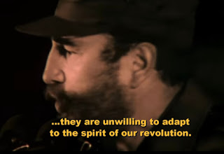
    Scarface opens with a genius tactic, they use real-life footage of the Mariel Boat-lift. This boat traveled from Cuba to the coast of Florida between April 15 and October 31st in the ’80s. These videos are shot with a home camera, they show families reuniting, people praying and overall the refugees getting to Florida. They use these shots in between a sequence of black scenes and Fidel Castro giving a political speech saying Cuba doesn’t need “Marielitos” (the nickname for those who were on the boat). This is a great way to open the film since it gives a sense of credibility for the rest of the movie.


    All these videos are connected by a black screen with the credits, and that is something I would like to incorporate into my intro. I think it’s a great way of making the intro seem less overwhelming. The shots are shaky and bad quality, but that black screen in between gives it a more professional look.


Stay tuned to see how it turns out!


Sources:

    H. F. Chacon Jr. | Oct 3, 2022. (2022, October 3). An analysis and review of Scarface (1983). The Tartan. Retrieved February 22, 2023, from http://thetartan.org/2022/10/3/pillbox/scarface 


https://youtube.com/@openingtitles364


Sunday, February 19, 2023

CAMBRIDGE PORTAFOLIO PROJECT: fonts

 Welcome Back!


    Today, I’ve decided to take a new route and investigate fonts. I’ve never understood the “drama” behind fonts, it seemed to be a very delicate subject to graphic designers (my entire family). I would watch my brother go on adobe and spend h o u r s changing the fonts, length, space in between, anything really. Now, after reading a couple of articles and watching videos I’ve realized, it is that deep.

    Fonts are a first impression of your text before it’s even read. It is what gives your text or even your movie personality, it’s a preview of what type of content they’re about to watch. Fonts are more than just the text itself, arranging them correctly and using them consistently is part of their design. 

    As my research went on I learned about how fonts affect audiences. Cursive fonts are elegant and normally used for formal events, invitations, certificates, or diplomas. Modern fonts are cleaner and give a more neutral look. Display/ bold fonts are meant to immediately catch the reader’s attention and make a statement. 

    Typography is one of the most important things experts comment on, it is the art of arranging and designing. For example; line length/spacing, point size, tracking, and kerning (adjustment of space in between letters). Typography sets the mood and theme, it is a reflection of your content. One key point to keep in mind is to try and keep your number of fonts to a minimum, “less is more” this shows how it’s better to have consistency with two fonts than to have seven or eight different fonts. Fonts are meant to be effective, it is important too; to leave enough white space in between, have a distinction between elements, and keep it consistent.

    Color, is the next best thing recommended by experts. It is defined as “non-verbal communication” It has its own phycology, and each color can convey different emotions. It is important to research what color fits best for your target audience. For example; red is the color of excitement, energy, passion, and danger. The color red project a lot of emotion. The font color red used in the movie “Scarface” by Brian de Palma is used to show power and even violence at first glance. 


    Overall, I would like to use the font to give a preview of my movie’s “vibe”. Usually for my type of movie intro fun and funky fonts would be used to portray the coming-of-age/ teenager genre, but for my fonts, I want to insinuate “there’s more” to that sequence of fun clips. The clips will deeply contrast with my font and that is exactly what I want, for it to feel a little uncomfortable. 

Here are some examples:


Sources:

Serifs, scripts, and everything in between: How fonts impact your content marketing. Points Group. (2023, February 15). Retrieved February 19, 2023, from https://pointsgroup.com/serifs-scripts-and-everything-in-between-how-fonts-impact-your-content-marketing/ 


Typography is a vital component in the world of advertising. Evok Advertising. (2020, June 2). Retrieved February 19, 2023, from https://evokad.com/typography-a-vital-component-in-the-world-of-advertising/ 


Saturday, February 18, 2023

CAMBRIDGE PORTAFOLIO PROJECT: target audience

 Welcome back!


    An important part of our project is our target audience, who is my movie/intro directed to? After a couple of research, I’ve found that the most important part is understanding who your target audience is; their age, gender, location, and interests. To who is my film going to appeal to?

I believe it’s easy to say my target audience is young adults, mostly teenagers. Since this project is a film intro and there’s not going to be no “marketing” or “distribution”, I want to focus on how the content reaches their audience. 

    Stanley D. Williams quotes “Successful stories subliminally invite audience members to participate mentally with the movie's main characters” in How Filmmakers Connect With Audiences, he reflects on the way the audiences immediately make connections with the film. Finding similarities in things like; personality, appearance, style, and age. They get “emotionally involved” as they find relations with the film so they find it “relatable”.

    To make the audience feel a greater connection with the film, directors like to incorporate physical structuring techniques. These include; POV shots, over the shoulder, long tracking shots in which the feeling of being in the same room as them is given, and long extreme close-ups to create that sense of intimacy. Emotional structuring can also help viewers feel connected, generating the feeling of sympathy, jeopardy, and relatability building an attraction that is purely emotional to the characters. Lastly, filmmakers use moral structuring to create a sense of connection. All films always have some type of moral conflict, and this is meant to be a conflict that is understood by the audience. This conflict engages audiences at a deeply emotional level developing sympathy or rejection towards a character. It is important to have an emotional, visual, and moral connection with the audience.

    In conclusion, I want to create a relationship with my audience by displaying what most of us see as our “daily lives”. Maybe an exaggerated version, but my viewers will experience a true taste of youth, no matter their age this will create a sense of relatability. Even though there will have a drastic change by the end, viewers will still understand and maybe even relate to the previous shots. 

Stay tuned to see how it tuns out!


Sources:

Understanding audiences. Independent Cinema Office. (2017, July 27). Retrieved February 18, 2023, from https://www.independentcinemaoffice.org.uk/advice-support/how-to-start-a-cinema/understanding-audiences/ 


Hardy, R. (2020, September 1). How to build a profitable audience for your films. Filmmaker Freedom. Retrieved February 18, 2023, from https://filmmakerfreedom.com/blog/audience-building-fundamentals 


Hardy, R. (2022, January 18). 3 types of audiences that drive indie film revenue. Filmmaker Freedom. Retrieved February 18, 2023, from https://filmmakerfreedom.com/podcast/three-audience-indie-film-business-model 


www.nuvotech.co.uk, N. L. (n.d.). How filmmakers connect with audiences. Movie Outline - Screenwriting Software. Retrieved February 18, 2023, from https://www.movieoutline.com/articles/how-filmmakers-connect-with-audiences.html#:~:text=Filmmakers%20emotionally%20suture%20the%20audience,beautiful%2C%20charming%2C%20and%20hospitable. 


CREATIVE CRITICAL REFLECTION

The day has come, this is officially my last post for this project. Thank you for tagging along, I hope you enjoyed it as much as I did :) H...